01 · Establish a hierarchy of colour
Blue carries the wordmark; orange is reserved for the small smile detail. The accent has a defined job instead of competing with the name.
Reward360’s travel OTA needed an identity of its own. I led the logo design end-to-end — from studying the competitive landscape to defining the colour, iconography and typography of the final mark.
 Hero · The final wordmark — Tripsure Blue with the orange-dot ü
Tripsure needed its own recognisable identity within a crowded travel category and bank-partner environment. The work focused on a practical identity system, not a claim that a new logo would independently drive bookings.
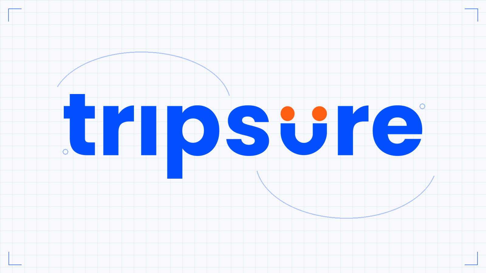
Blue carries the wordmark; orange is reserved for the small smile detail. The accent has a defined job instead of competing with the name.
The ü smile can be extracted for compact surfaces without introducing a separate, unrelated symbol.
A lowercase Inter wordmark, a restrained palette and one embedded mark provide a common basis for partner rollout.
Use the blue wordmark and orange ü detail as the identity’s organising idea. Category observations informed the direction; measured distinctiveness is a separate question.
The smile adds personality while the readable wordmark carries the name. The icon and full lockup should still look like the same identity.
Use launch bookings and GMV as business context. Without a comparison that isolates the identity, those results should not be presented as the logo’s measured impact.
Before sketching a single letterform, I mapped the OTA partners currently live in the market — MakeMyTrip, Cleartrip, Goibibo, Yatra, EaseMyTrip, ixigo, Booking.com, Agoda and more. A clear pattern emerged: a sea of reds and oranges, generic travel iconography, and interchangeable typography.
If Tripsure launched looking like one more red travel logo, it would disappear on day one.
Nearly every OTA leans on warm, urgent tones. One more red travel logo would vanish on the shelf from day one.
Planes, ticks and pins everywhere — app icons with near-identical recall when placed side by side.
Wordmarks that could swap brands without anyone noticing — no typographic ownership anywhere in the category.
Launching into this pattern meant disappearing. Tripsure had to break the category habits deliberately.
Be different in three deliberate ways — colour, iconography and typography — so users can recall the brand at a glance.
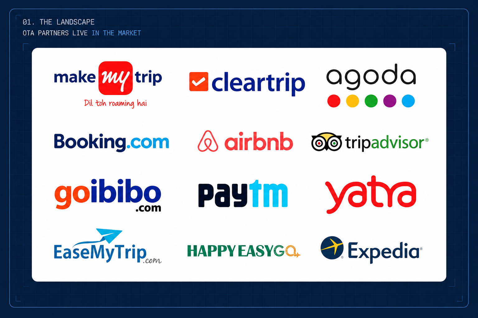 Plate · OTA partners live in the market — a sea of reds, oranges, planes and ticks
Three deliberate choices separate Tripsure from every other OTA on the shelf — each one picked as a direct counterpoint to the category’s habits.
Where the category screams red, Tripsure speaks in a confident electric blue — the colour of assurance, fitting for a brand whose name promises a “sure trip”. Orange is used sparingly, as a signal, not a shout.
A confident electric blue as the foundation — the colour of assurance in a category that screams urgency.
Used sparingly, as a signal, not a shout — energy without joining the category’s red-orange noise.
Clean, open surfaces that let the wordmark and the “ü” carry the identity on their own.
No planes, no pins, no ticks. The two orange dots over the “u” turn the letter into a smiling face — a traveller at ease. It doubles as the favicon and app mark, so the brand stays recognisable even at 16px.
 Plate · The ü smile mark — favicon & app icon
Set in Inter — a modern, highly legible grotesque built for screens. The all-lowercase, heavyweight setting makes the wordmark feel approachable and product-native, not corporate. One typeface carries the entire brand.
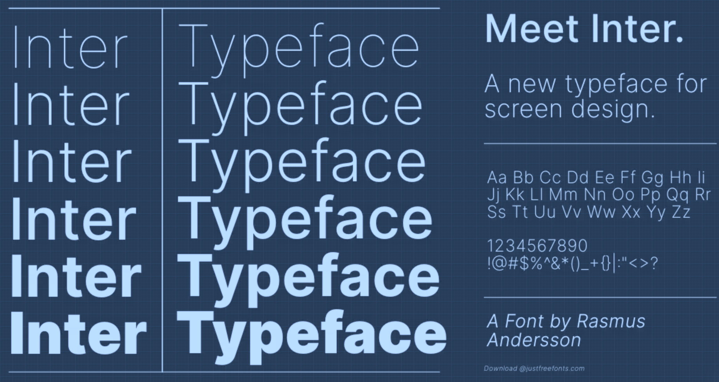 Plate · Inter · Bold · Lowercase
The final identity is a single-lockup system: the full wordmark for headers and marketing, and the “ü” cropped out as the favicon and avatar. Because the mark lives inside the letters themselves, the identity has a common visual reference across surfaces.
Plate · Tripsure_Final — primary lockup on light surfacesThe launch snapshot records 101 bookings, ₹23.27 lakh GMV and travel across 15 countries. These describe activity around the launch, not a measured lift caused by the identity. The direct design output is the wordmark, icon and visual system.
The leadership lesson is to be precise about both scope and evidence: deliver a usable identity system, then distinguish what shipped from what the business achieved around it.
Tripsure is live today on ICICI iShop, with HDFC SmartBuy lined up next. Within days of the milestone campaign, the brand crossed its first hundred bookings across 15 countries.
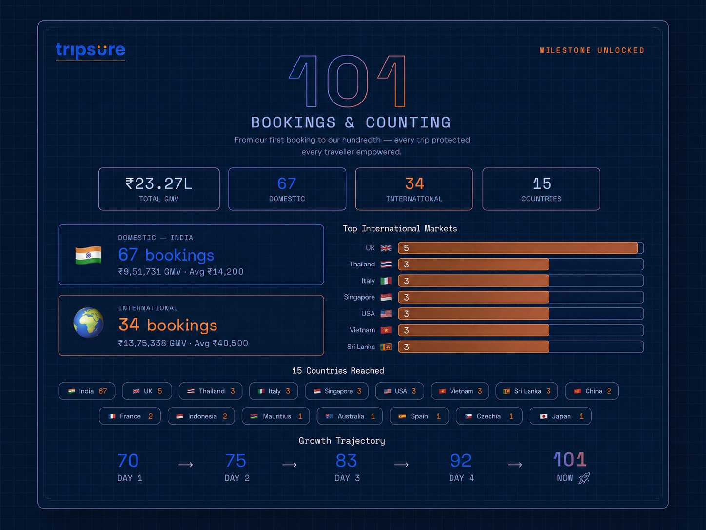 Plate · Milestone metrics — the identity in action on the live campaign
Tripsure is live inside ICICI Bank’s iShop rewards ecosystem — the wordmark, favicon and colour system deployed across the full booking experience.
The same identity system is built to travel. HDFC SmartBuy is the next partner surface, with the mark ready to scale without modification.