01 · Compare like with like
Keep baggage, flexibility, seats and meals in consistent positions so the traveller can see which differences matter.
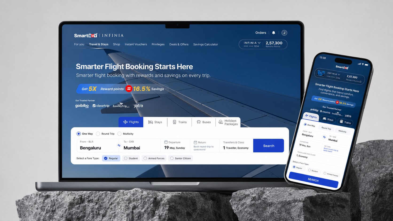
HDFC SmartBuy is a rewards portal for booking travel using credit card points. Flight booking had high drop-offs due to poor clarity, weak comparisons, and fragmented post-booking updates.
A flight option is more than a price. Travellers also need to compare baggage, flexibility, partner differences and the consequences of cancellation. The problem frame therefore extends from selection to the communication after booking.
Keep baggage, flexibility, seats and meals in consistent positions so the traveller can see which differences matter.
Delta pricing makes the upgrade cost explicit. A recommendation needs a visible benefit, not just a more prominent purchase button.
Reduce visual density without hiding cancellation conditions or baggage limits. Those details can change which fare is right for the traveller.
Audit selection, policy interpretation and post-booking communication together. Completing a payment does not end the customer’s need for clarity.
Use a consistent comparison structure without flattening the meaningful differences between fare families and partners.
Give price and benefit differences clear hierarchy. Recommendations and urgency should help customers evaluate the choice, not substitute for understanding it.
When I took ownership of the flight experience, I began with a comprehensive audit rather than a redesign. I audited the end-to-end flow, identified key UX issues, and proposed UI/UX improvements to simplify decisions, improve booking clarity, and increase conversion and retention.
A repeatable framework for moving from ambiguous problems to outcomes that work for users and the business.
Research user needs and validate assumptions before a single pixel is placed. User research · Jobs-to-be-done · Assumption mapping.
Connect user value with business goals and measurable outcomes. OKR mapping · Success metrics · Stakeholder framing.
Systems thinking to build scalable, coherent experiences. Design systems · IA & flows · Component thinking.
Transform complexity into intuitive, accessible solutions. Cognitive load · Accessibility · Progressive disclosure.
Partner with product, engineering and stakeholders to drive impact. Cross-functional · Design critique · Handoff & specs.
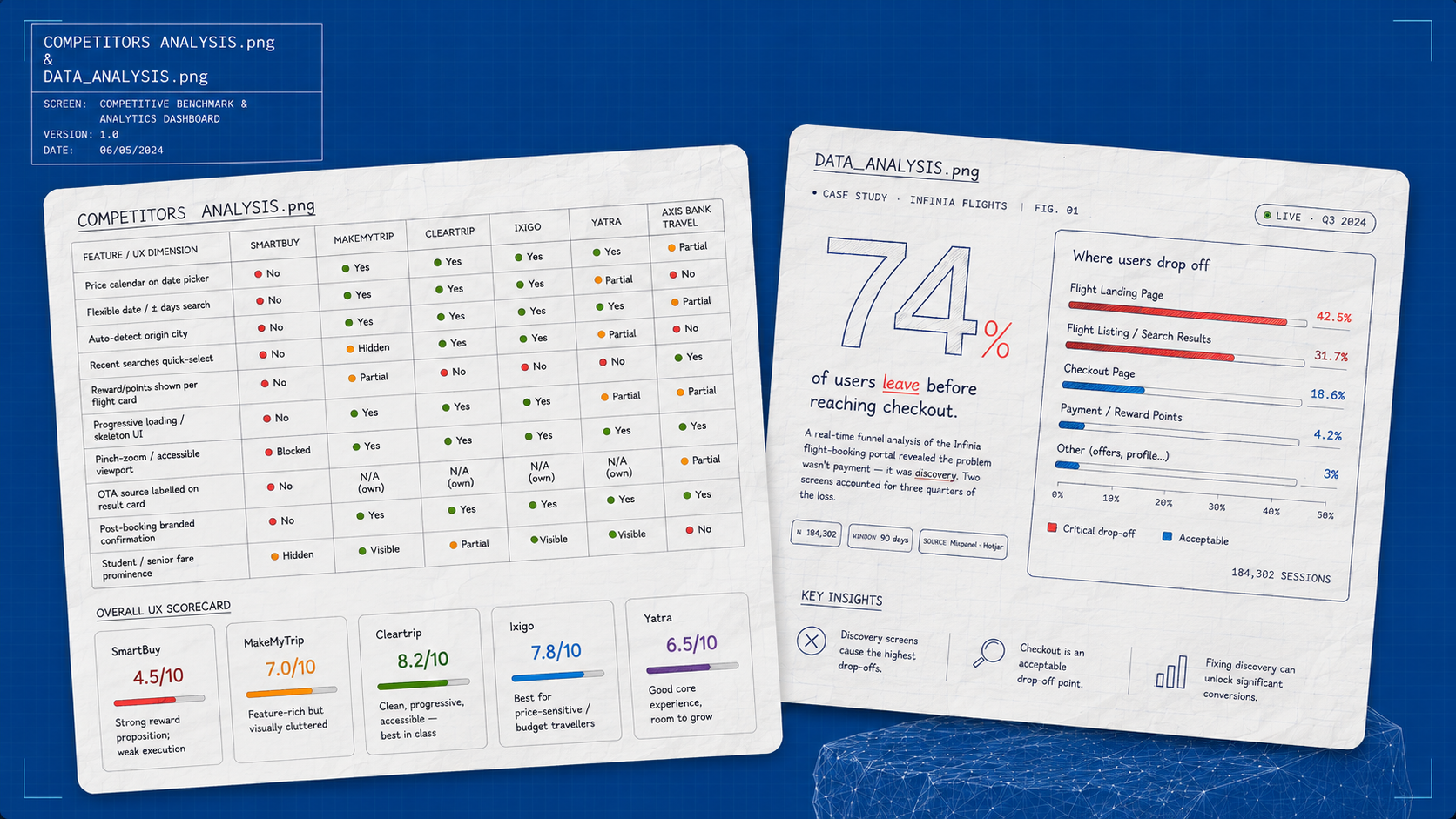
The flight search and fare selection experience had high visual density and limited scannability — increasing cognitive load and slowing decision-making. The audit combined journey mapping, UI/UX gap analysis, competitor analysis and real-time data deep dives across the full flight flow.
Multiple price points per flight created confusion and reduced trust.
Weak visual hierarchy made it hard to compare options quickly.
High information density increased cognitive load during scanning.
The fare selection modal lacked clear differentiation between options.
OTA listings competed equally with flight information.
CTAs were fragmented, reducing conversion focus.
Extra steps and redundant screens slowed booking and increased drop-off.
Users received inconsistent emails with missing booking information.
Developer jargon made buttons and errors unclear — “Error 502” offered no actionable guidance.
I led the design direction for revamping the pricing and selection flow — introducing clearer differentiation and a structured comparison model to improve engagement and conversion efficiency.
Faster flight comparison and selection, reduced decision fatigue, improved trust through pricing transparency, and a simplified CTA flow built for high-frequency travel shoppers.
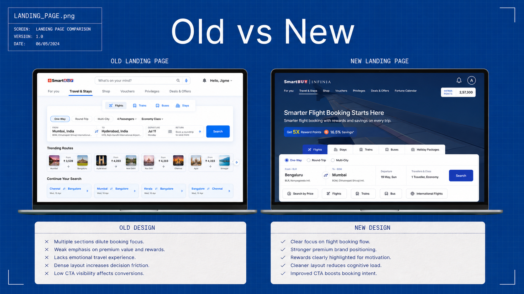
The old landing page diluted booking focus across multiple sections — a dense layout with weak emphasis on premium value and rewards, and low CTA visibility. The new page opens with the booking flow, stronger premium brand positioning, and rewards highlighted for motivation.
Multiple competing sections replaced with a clear, single-purpose flight-booking flow.
Reward points and savings surfaced prominently — 5X points and trip savings lead the page.
A cleaner layout and an improved call-to-action lift booking intent from the first screen.
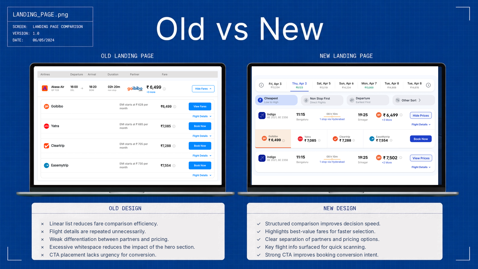
The old results were a linear list — flight details repeated unnecessarily, weak differentiation between partners and pricing, and CTAs without urgency. The redesign introduces a structured comparison that improves decision speed.
Clear separation of partners and pricing options, so fares can be scanned and compared at speed.
Best-value fares are highlighted for faster selection and a shorter path to a confident choice.
Flight time, stops and price carry clear visual weight — surfaced for quick scanning.
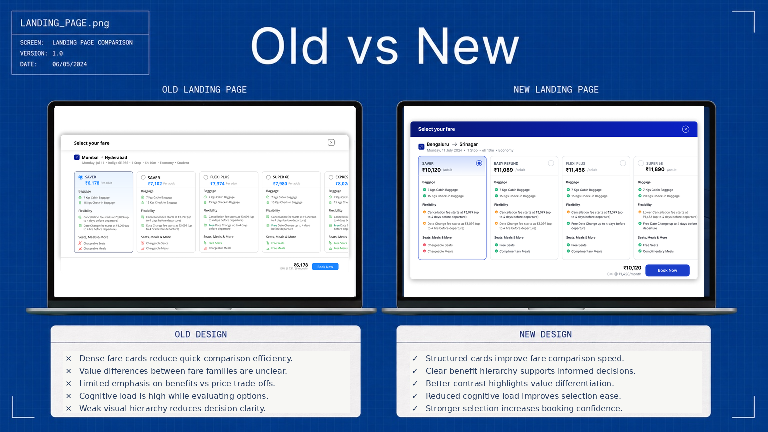
Dense fare cards made value differences between fare families unclear, with limited emphasis on benefits versus price trade-offs. The new structured cards create a clear benefit hierarchy that supports informed decisions.
Baggage, flexibility, seats and meals laid out consistently across every fare family.
Better contrast highlights value differentiation — what each step up actually buys.
Delta pricing (“+₹615 for Flexi”) and a recommended badge guide the upgrade decision.
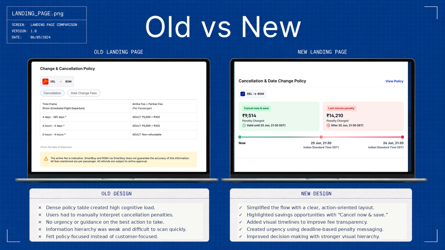
The old policy table was dense and policy-focused — users manually interpreted penalties with no urgency or guidance on the best action. The redesign is customer-focused and action-oriented.
Savings opportunities highlighted so the best action to take is obvious at a glance.
Penalty stages plotted against deadlines improve fee transparency.
Deadline-based penalty messaging creates urgency and stronger decision-making.
The work reports a 34% increase in flight bookings and a 41% reduction in support tickets. The 3.2× calendar figure compares users who engaged with the calendar with those who did not; it is an association, not an experiment showing the calendar caused the uplift.
The leadership lesson is to set a quality bar across the complete decision: selection, commitment and what happens when plans change.
The results below cover the redesigned funnel. They describe changes observed alongside the work; they do not establish that any single interface change caused an outcome.
Individually, rewriting an error message or removing one redundant screen feels small. But across a journey that millions of users traverse, these micro-improvements compound into measurable conversion lifts and significant support-ticket reductions.
Email communication was completely absent for critical booking events. Users were anxious not because the product was broken, but because it was silent. Building the communication layer was technically unglamorous — but it had an outsized impact on user trust.
HDFC and ICICI have different brand guidelines, but users expect the same quality of experience. The template system had to be flexible enough for brand compliance while rigid enough to ensure no critical information was ever missing.
Fare Families — a brand-new concept for these portals — was received well partly because we’d already fixed the baseline friction. Users were more open to exploring a new feature when the rest of the journey finally felt reliable.