01 · Daily confidence
Today’s collection and settlement access form the operational core. The question is whether a merchant can understand their money before exploring another product.
End-to-end design ownership on India's largest merchant payment platform. This case study covers four sub-projects shipped under the PhonePe Business umbrella — each solving a distinct merchant problem, together forming a coherent product experience.
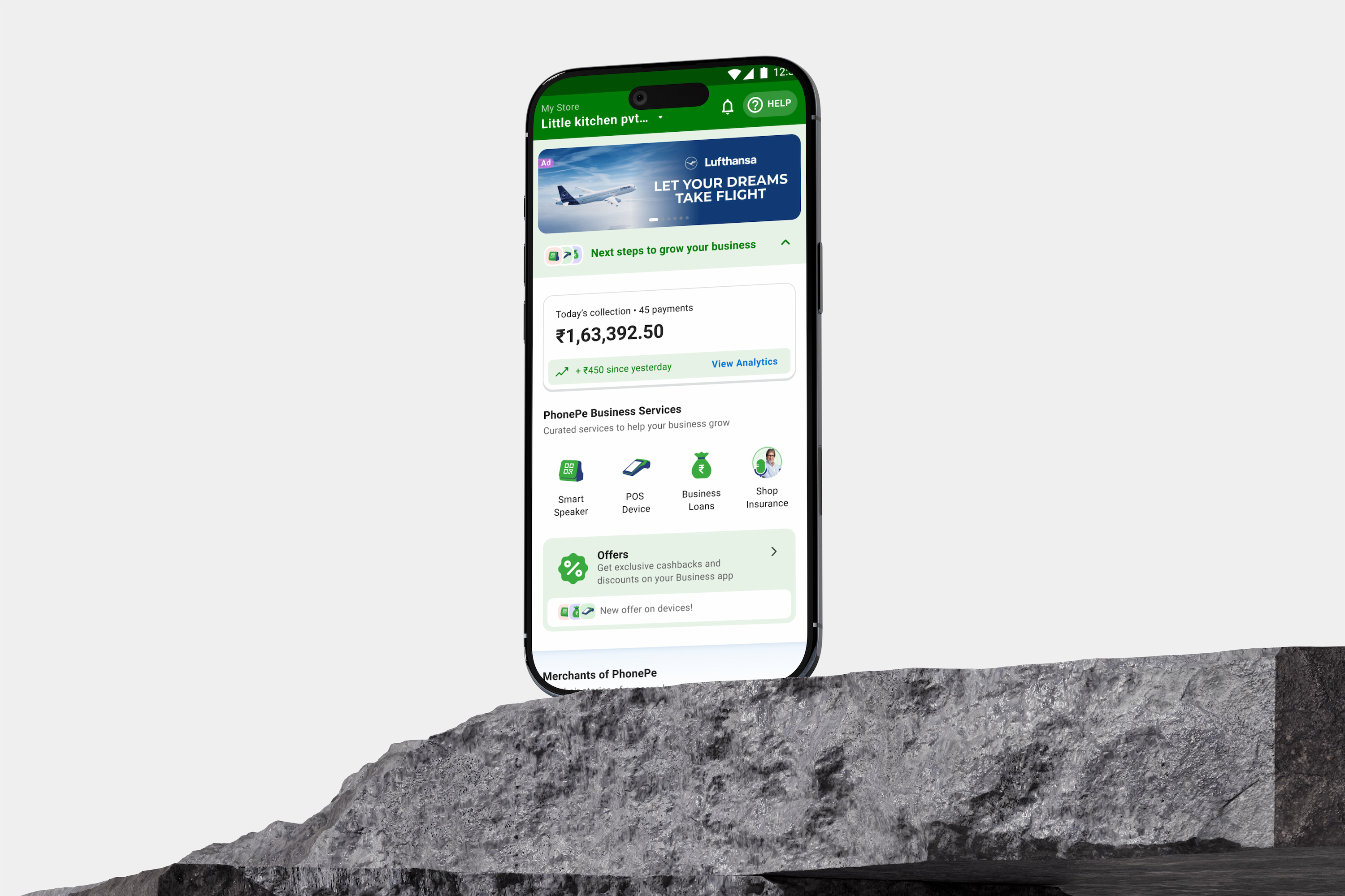 FIG 0.0 — PhonePe Business · Merchant Home
The brief called for an app that helped merchants conduct, grow and manage their business. The design task was to turn that ambition into an order of attention: checking money should stay easy even as commercial services expand.
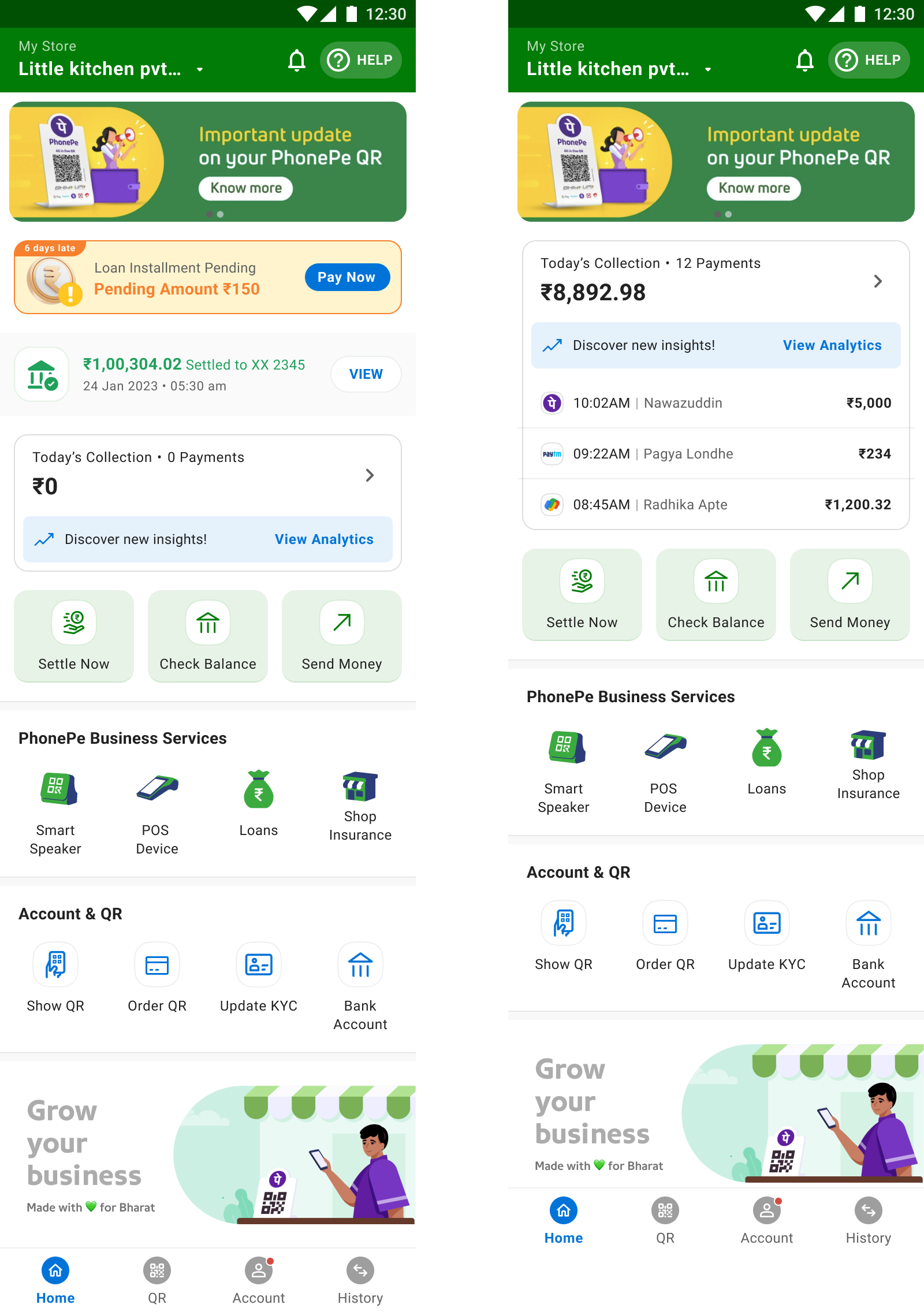
Today’s collection and settlement access form the operational core. The question is whether a merchant can understand their money before exploring another product.
Devices, lending and insurance sit within the same home experience. Their visibility must not displace collection validation or settlement tasks.
Account, QR and service-management actions support life after purchase. Product growth creates management needs as well as acquisition opportunities.
Use Conduct–Grow–Manage to organise competing services around merchant activities. The framework came from the product brief; research helped translate it into a usable structure.
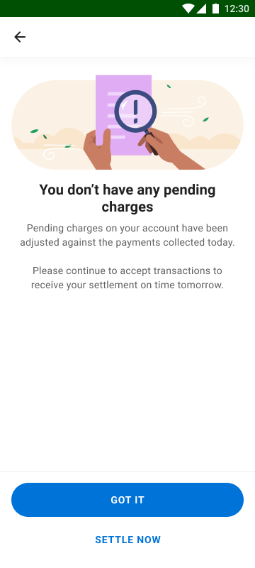
Replace an automatic-settlement promise when pending charges prevent it. Show the amount, explain why it is due and provide a path to clear it. Trust depends on an accurate next step.
Lending milestones span six consecutive months; SmartSpeaker ordering begins with a ₹2 refundable AutoPay mandate. Both flows need to explain future conditions, not only make the first tap easier.
PhonePe for Business is where merchants onboard, collect UPI payments, access settlements, manage devices, and apply for loans. The home screen is the face of all of this — the most used, most interacted, and most sought-after page. Yet it was chaotic: no hierarchy, buried features, no revenue channel, and no reason for a merchant to feel the app was built for them.
Settle Now, loan eligibility, device management — all buried. Merchants couldn't find critical functions without multiple taps.
Auto-settlements weren't initiated in edge cases but merchants received no notification — leading to rising support tickets and merchant distrust.
SmartSpeakers, POS devices, loans, and shop insurance had no proper discovery surface. The home page wasn't functioning as a revenue channel.
Merchants used the app because they had to — not because they wanted to. No sense of the app being a companion to their business.
From the product brief: the app needed to help merchants conduct, manage, and grow their business — integrating different lines of business and generating revenue for both merchants and PhonePe. But critically, it had to do this without creating funnels that trap. Absolute clarity going in, and always a way out.
The merchant comes to the app because it's a NEED. Our job is to create the WANT. Good visuals, good experiences, good support — make them feel the app is for THEM, not US.
Minimize clicks and rabbit holes. Every feature a merchant needs should be reachable from the home screen with the fewest possible taps.
Don't patch the existing architecture. Rebuild it around the three things every merchant does: conduct their business, grow it, and manage it.
Devices, loans, and insurance shown upfront with illustrations and clear benefit statements — informational, not pushy.
Merchants should be able to find solutions to all their problems in the shortest time — via a strong in-app support centre, not a call centre.
I ran heuristic audits on the existing home screen, analysed support ticket themes, reviewed analytics drop-off data, and conducted merchant interviews across business types and geographies. The clearest signal: merchants didn't think in terms of app features. They thought in terms of business activities — "did I get paid?", "is my money in my account?", "how do I get a loan?"
Research helped translate the product brief into a workflow-based structure: the framework of Conduct – Grow – Manage. Three verbs. Three zones. One clear mental model.
P2ML merchants visit at least once a month. P2P merchants get everything via notifications — they don't need to visit daily. The home screen had to earn engagement from users who didn't have a reason to open the app.
Any merchant who comes onto the app expects simplicity and ease of doing their business — timely validation of collections and payments made digitally.
Validate payments and settlements seamlessly, with a detailed transaction and settlement history.
Settle Now as a primary focus of the entire app — and auto-settlements shown in a clutter-free, easy-to-understand format.
Analyze sales performance and growth trends; generate reports for insights into expansion.
Once merchants have validation of what's happening, they want to grow. Value-added services shown upfront in an informational, clear manner.
Explore, purchase, or lease devices; track orders and manage owned devices.
A clean, easy discovery point for business loans — the merchant's route to expansion.
Promotions and discounts that nudge merchants toward services — visibility keeps them hooked.
Crucial for established merchants who have availed devices and services — their control panel.
Business info, billing and payment settings, language and notification preferences.
Manage owned devices, track orders, troubleshoot issues, pay device dues.
Monitor loan status, outstanding balance, and upcoming payments.
In-app chat support for immediate help — with self-serve solutions first.
FIG 4.0 — Before / After
Any merchant who opens the app expects simplicity and ease. They need timely validation of payments, instant access to settlements, and a clear view of today's collections. Everything in this zone is about reducing friction for the core business activity.
Total day's collection shown as the primary number on home, with recent transactions listed immediately below — no scrolling required to validate payments.
For the vast majority of merchants, getting money in their bank account is the best validation. Settle Now becomes a primary home-screen action, not buried in a flow.
Redesigned error messaging for settlement failures: clear ribbon on home, detailed breakdown on the settlement page, and deep-links to resolve pending charges.
Monthly collection with month-on-month comparison, 7-day chart, average daily collection, and transaction count.
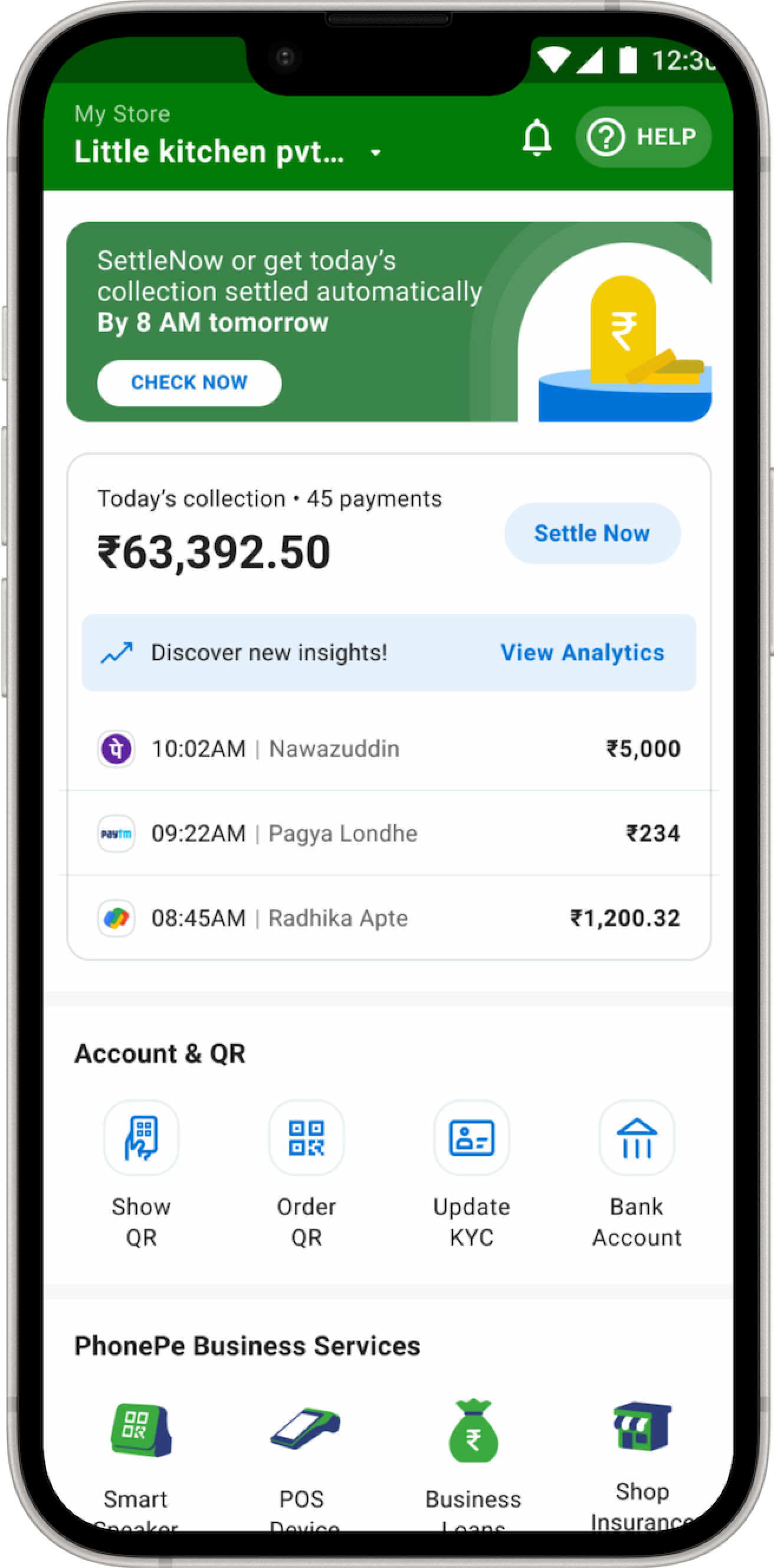
Once merchants have validation of their daily business, they're open to growing it. Value-added services are surfaced in context — with illustrations that clarify what each product does.
SmartSpeaker, POS Device, Loans, Shop Insurance — shown with iconography and clear labels, accessible one tap from home.
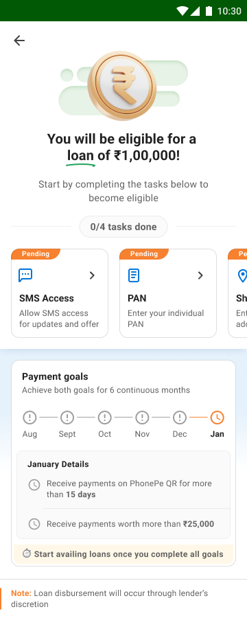
A dedicated eligibility journey with 3 sections: Tasks (one-time to-dos like PAN submission), Milestones (6-month payment targets), and Devices (maintain 0 dues). Gamified progress to drive return visits.
Contextual banner slot for promoting the highest-priority offering at any given time — loans, new devices, or insurance — with illustration and a clear CTA.
Promotions surfaced with clear value statements — a nudge like "buy a speaker and save ₹500" goes a long way.
Merchant notices a "Business Loan" widget on the home screen while checking transactions. High-intent entry point.
Coachmarks explain the 3 sections of eligibility — Milestones, Tasks, and Devices — reducing drop-off at entry.
Binary one-time to-dos: submit PAN, add shop address, convert to daily settlement. Completable in under 5 minutes.
Meet the displayed collection and activity targets for six consecutive months. Milestone progress becomes the merchant's reason to return.
Maintain 0 dues on owned SmartSpeaker or EDC. Also an upsell surface for merchants who don't own a device yet.
Once all criteria are met, the merchant applies. The third-party lender reviews the application. Completing the eligibility journey is not a promise of approval.
For established merchants who have availed devices and services, management is critical. The profile and settings architecture was rebuilt into two clear buckets — Business Settings and App Settings.
Show QR, Order QR, Update KYC, and Bank Account — the most-needed account actions — surfaced directly on the home screen.
Track orders, troubleshoot SmartSpeakers with a real-time diagnostic flow, pay device dues, and explore upgrades — all without calling support.
A real-time device health diagnostic that fetches signal data from the device directly — replacing a flow entirely dependent on user-reported inputs.
Business settings and App settings — clearly separated. T&C repositioned. Logout de-emphasised.
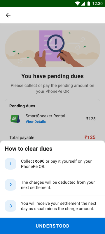
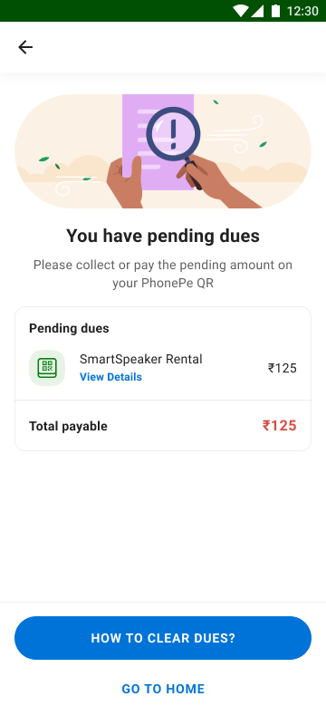
Merchants were seeing "this amount will be auto settled by 8 AM tomorrow" even when settlement couldn't happen due to pending charges. We corrected the messaging, added proactive home-screen ribbons with "View Charges" CTAs, and built a pending-dues explanation flow.
The previous promise of automatic settlement did not match the blocked state. The revised sequence makes the reason visible and explains how charges can be cleared.
Trade-off: The trade-off is a more explicit interruption to the merchant’s day in exchange for an actionable explanation. The design should not reassure someone about a transfer that cannot yet happen.
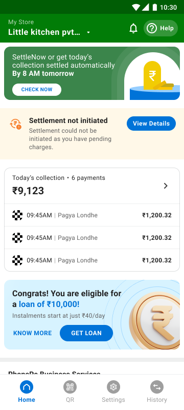
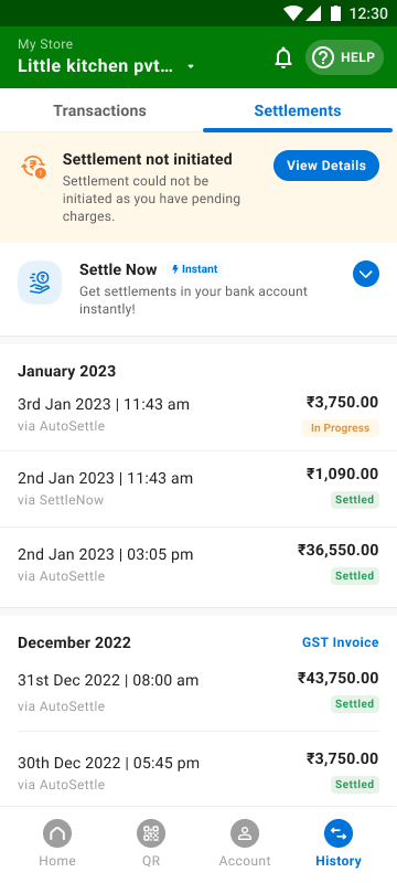
Settlements tab —
not initiated alert
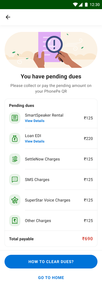
Pending dues —
amount & CTA
Charge breakdown —
line by line
"How to clear" —
3-step explainer
Charges cleared —
settlement resumes
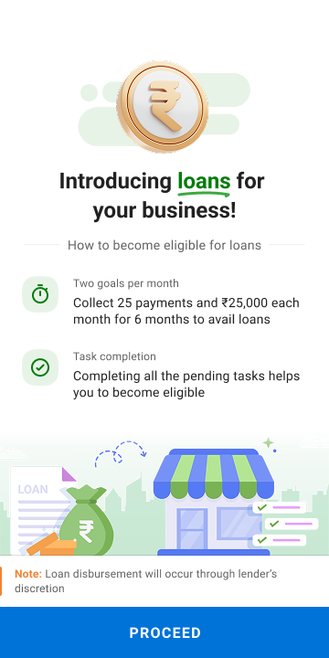
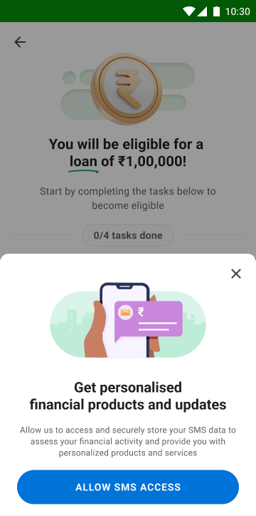
The eligibility journey outlined above needed two production flows: the top-of-funnel states a merchant moves through while working toward eligibility, and a guided first-time-use flow that explains the rules up front. Both are shown below.
Separate one-time tasks from recurring collection goals and device dues. Coachmarks make the six-month requirement visible before the merchant interprets progress as an immediate loan offer.
Trade-off: Milestones provide structure, but they also expose a long commitment. Product clarity requires explaining that meeting the displayed goals leads to an application and lender review.
Loan intro —
eligibility overview
SMS permission —
personalised offers
0/4 tasks —
PAN & SMS pending
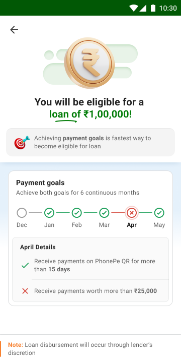
April missed —
goals in progress
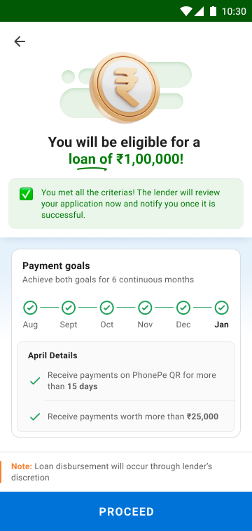
All goals met —
apply now
First impression —
what loans offer
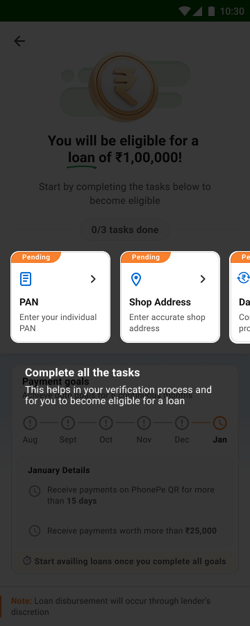
Task coachmark —
what to complete
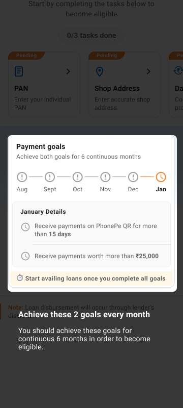
Goals tooltip —
6-month commitment
SMS access —
personalised offers
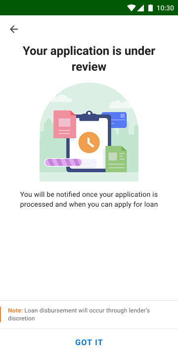
Under review —
lender notifies
The original device-purchase flow required full payment before dispatch — a friction point for cash-conscious merchants. We redesigned it around a ₹2 refundable AutoPay mandate to confirm intent, deferring plan selection and setup-fee payment to the point of physical delivery — reducing the payment required before delivery while keeping the later fees visible.
The order screen separates the ₹2 mandate now from plan selection and setup fees at delivery. The product decision changes when commitment occurs, not merely the number of checkout screens.
Trade-off: Deferring payment can make ordering easier while moving part of the decision to delivery. That makes clear communication about the mandate, refund and later charges essential.
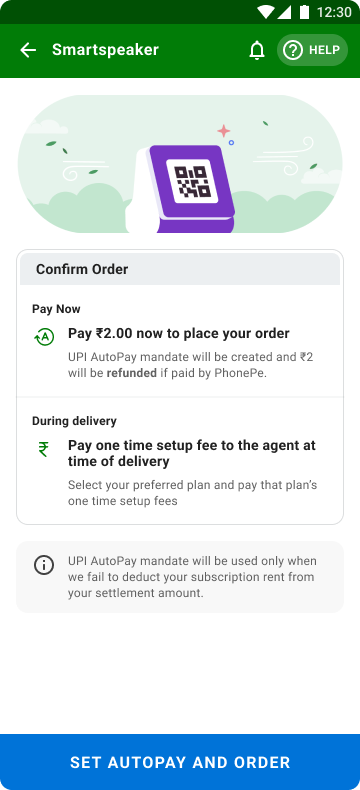
₹2 AutoPay mandate —
confirms the order
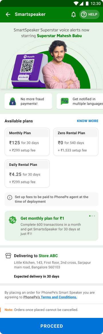
Plan selection —
superstar voice upsell
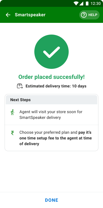
Order confirmed —
clear next steps
Every element must earn its place. No decorative complexity, no ambiguous icons. If it doesn't serve the merchant's workflow, it doesn't belong on the home screen.
Keeping merchants trapped backfires. Clear escape hatches in every flow, no dark patterns, no forced funnels. Trust is built by giving control back.
Merchants come because they need the app. The design's job is to make them want to come back. Delight isn't decoration — it's return engagement.
Value-added services understood at a glance through illustrations. A merchant shouldn't need to read to know what a SmartSpeaker does for their business.
P0 on home is today's collection — not a loan banner. Context determines priority. The home screen adapts to what the merchant actually needs in that moment.
Merchants who don't know why their settlement didn't happen raise support tickets. Accurate, proactive messaging about settlement status is as important as the settlement itself.
The reported +15% DAU and ₹20Cr monthly incremental revenue describe the wider redesign. They should not be attributed to one screen or to one designer. Settlement recovery, lending eligibility and device ordering also have distinct customer jobs; greater time in the app is not automatically a better outcome.
The leadership lesson is about prioritisation across a portfolio: a shared framework lets different services coexist without giving every business line equal prominence at every moment.
Reported results following the redesign span engagement, service discovery and revenue. These are shared product outcomes; the figures do not isolate the effect of each design decision.
Merchants check this app between serving customers. The Conduct–Grow–Manage framework worked because it mirrors how they already think about their day — not how the org chart is structured.
With devices, loans, analytics, settlements, and QR all competing for home screen real estate, the framework became a shared language across product, engineering, and business.
The biggest merchant anxiety wasn't a broken flow — it was silence. Merchants didn't know why their money wasn't in their account. The design response made blocked settlement states explicit and provided a path to resolution. That is a concrete improvement in the information available to a merchant, even without isolating its effect on support volume.
Surfacing value-added services in the right context improved both merchant experience and revenue. Merchants engaged because they saw value, not because they were trapped.
The Loan Eligibility journey introduced milestone-based progress that gave merchants a reason to open the app even on days they didn't collect a payment. Designing for consistent re-engagement within a 6-month window was as important as the final application screen.