01 · Support the existing habit
Remembered recharges and contact-first entry reduce repeated setup. Plan discovery remains available when the customer’s need has changed.
A complete overhaul of PhonePe’s highest-frequency product surface — making utility payments faster, clearer, and more reliable for users across India.
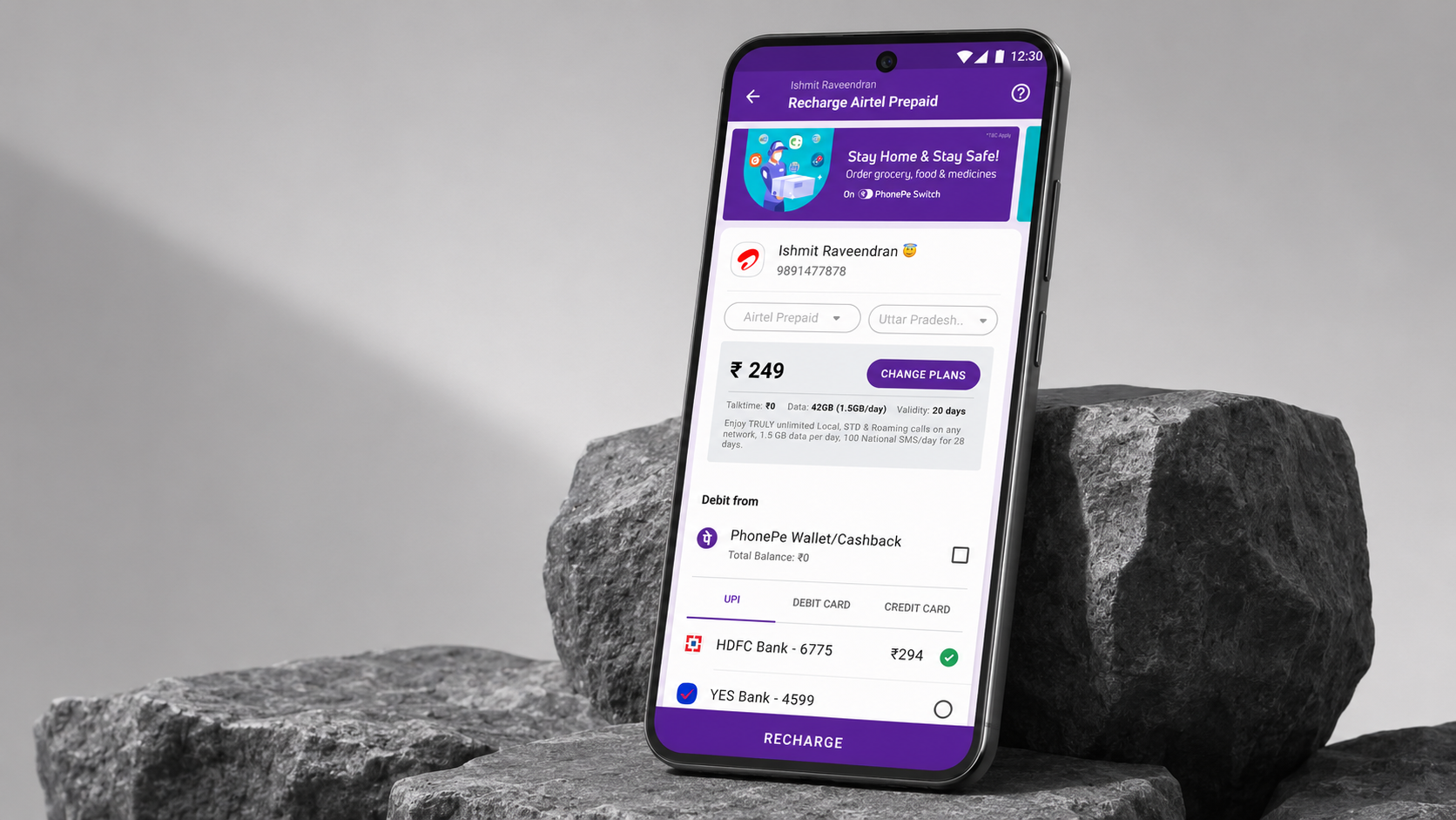
Recharge is a repeat task, but the information behind it can change or fail to load. Faster entry only solves part of the problem. The product also needs an honest response when it cannot reliably identify a valid plan.
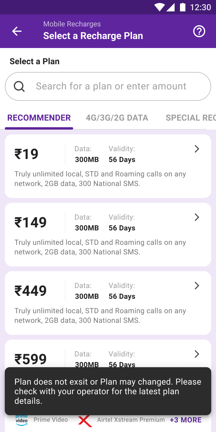
Remembered recharges and contact-first entry reduce repeated setup. Plan discovery remains available when the customer’s need has changed.
A plan can become stale after it is listed. The interface needs to explain that state before the customer mistakes an available card for a guaranteed offer.
The manual-amount screen allows continuation when a plan cannot be fetched, with a risk warning. Availability is preserved, but the information gap remains and needs to be visible.
Use last-recharge context and detected operator details to reduce effort, while keeping the plan and amount open to review.
Show validity, data and price in scannable plans, with benefits available in detail. A large plan catalogue needs structure more than additional promotional emphasis.
Design retries, stale-plan warnings and manual-amount fallback as distinct situations. A fallback is not equivalent to confirmed plan information, even when it allows the journey to continue.
Operators offered 100+ plans. Users had no way to quickly find the right recharge for their needs and budget.
Different UI logic for DTH, broadband, electricity, gas, and water — no unified mental model across bill types.
Payment failures were opaque — users didn't know if their money was deducted or what to do next.
No smart defaults. Repeat rechargers re-entered operator, number, and plan every single time.
Recharge is habitual — users do it the same way every time. The challenge is reducing the cost of that habit, not reinventing it. Research spanned diary studies, analytics, support-ticket analysis, and interviews from power users to first-time digital bill payers.
For most users, the ideal recharge is remembering what they did last time and doing it again in three taps.
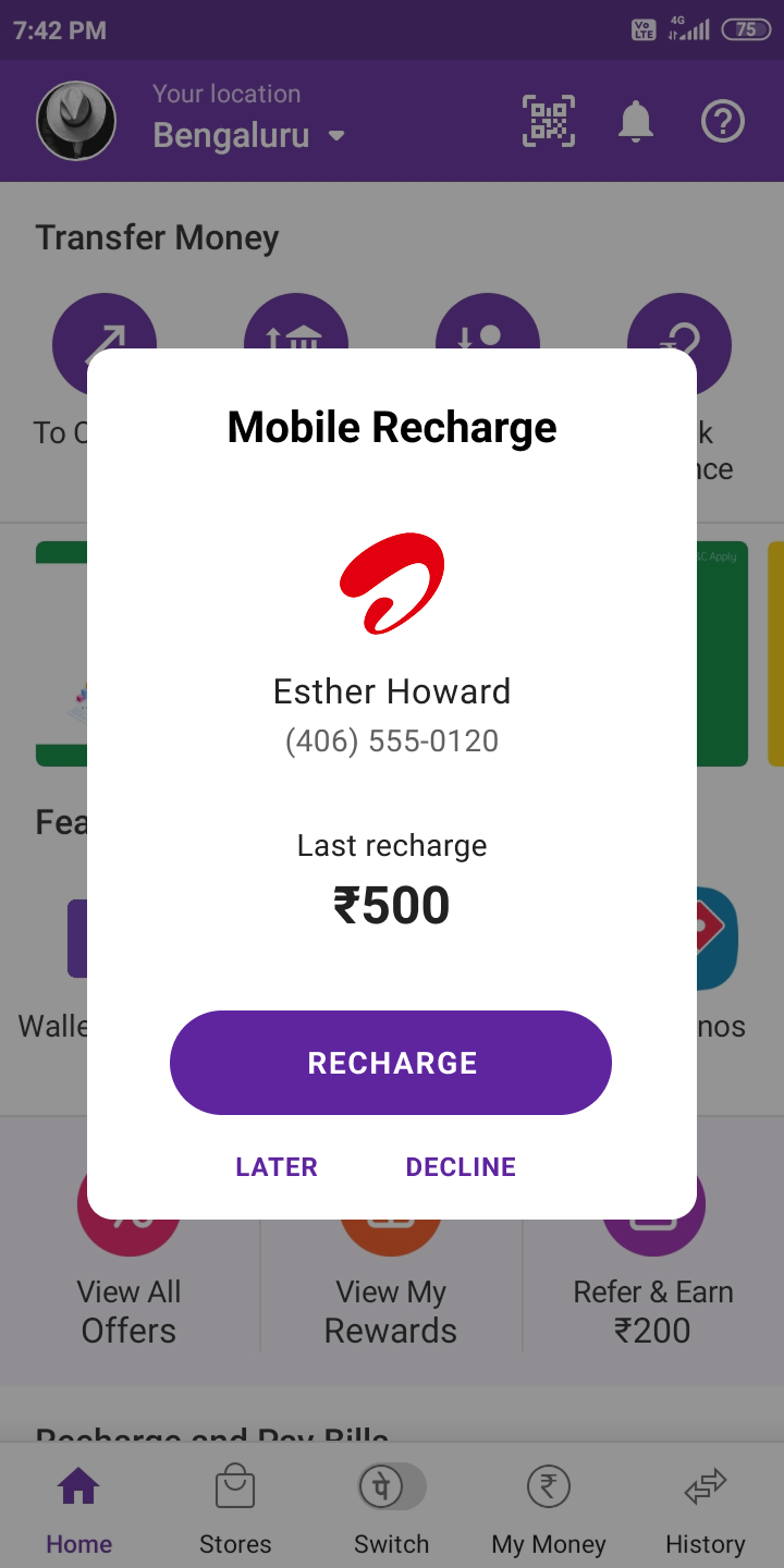
Contextual prompt —
last recharge, one tap
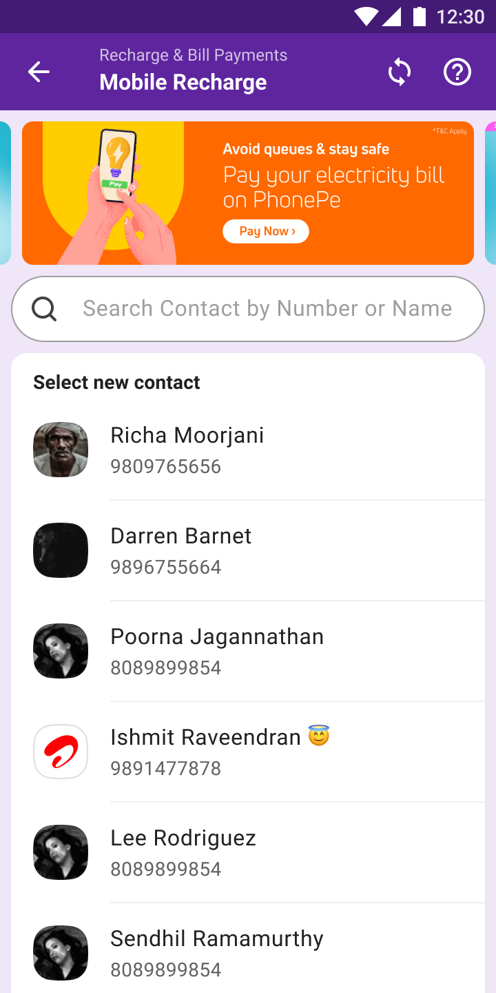
Contact-first entry —
operator auto-detected
Make 100+ plans navigable without overwhelming the user.
Surfaces "Best Value", "Popular", and "Unlimited" plans; filters by validity, data, price.
An expandable card showing OTT benefits, data quota, SMS, validity, and total cost.
Outstanding amount, due date, and last payment shown clearly before any action.
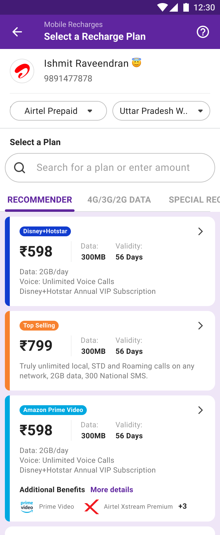
Recommender — 100+ plans,
ranked & filterable
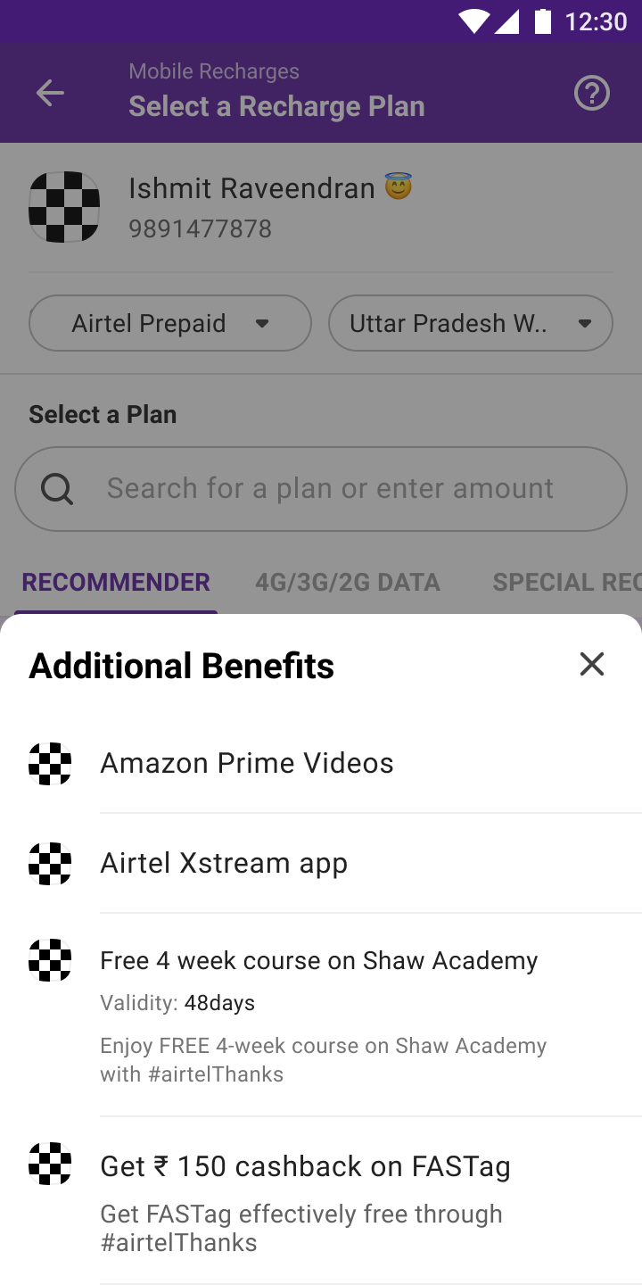
Benefits unpacked —
OTT, courses, cashback
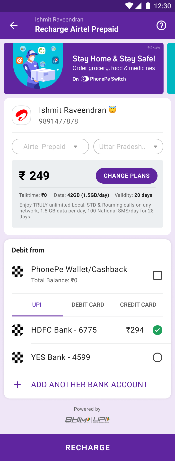
Plan + payment —
one screen, one tap
Design the failure and edge-case states that make users feel safe.
Failures tell users immediately whether money was deducted, when a refund arrives, and what to do.
Operators can take time to activate a recharge. Pending states distinguish processing from failure and explain what the user should expect next.
A shareable digital receipt for every payment — amount, operator, account, timestamp, downloadable.
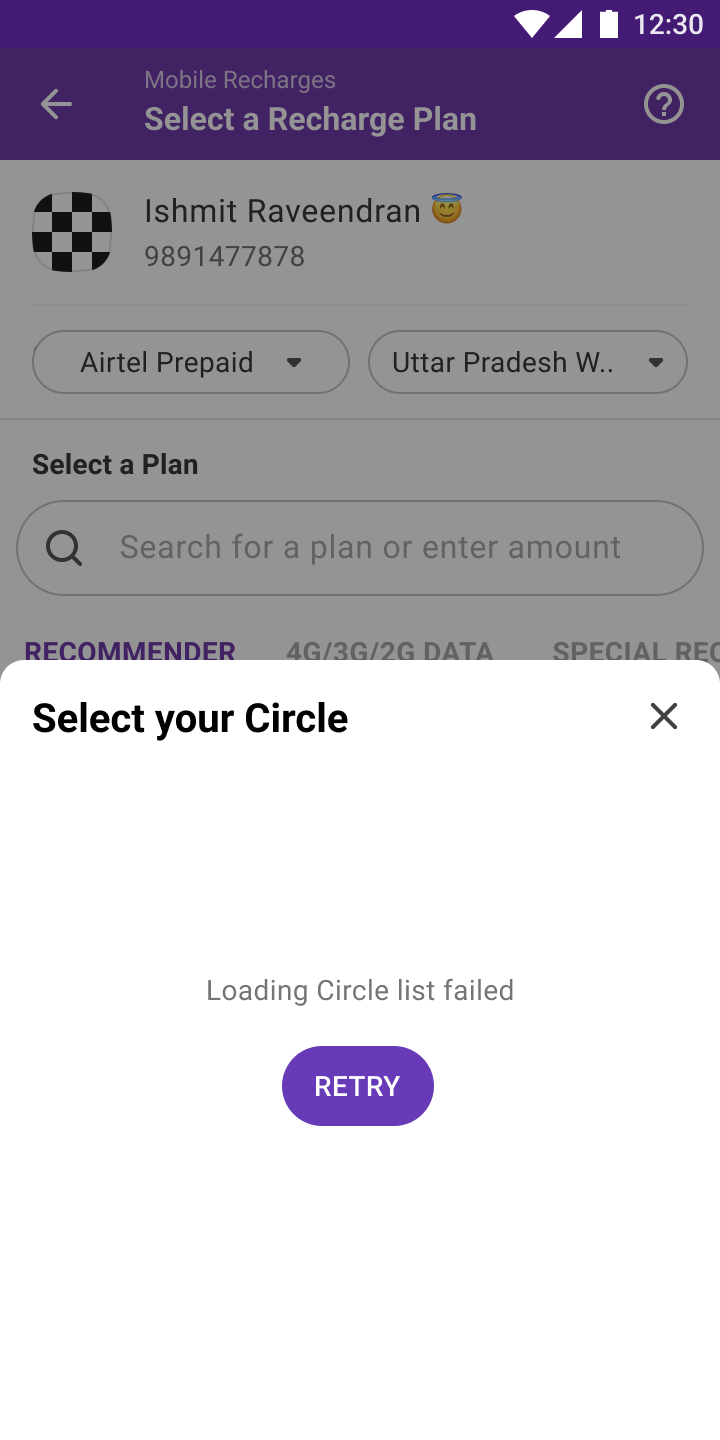
Circle load failed —
a clear retry, no dead end
Stale plan caught —
honest, immediate message
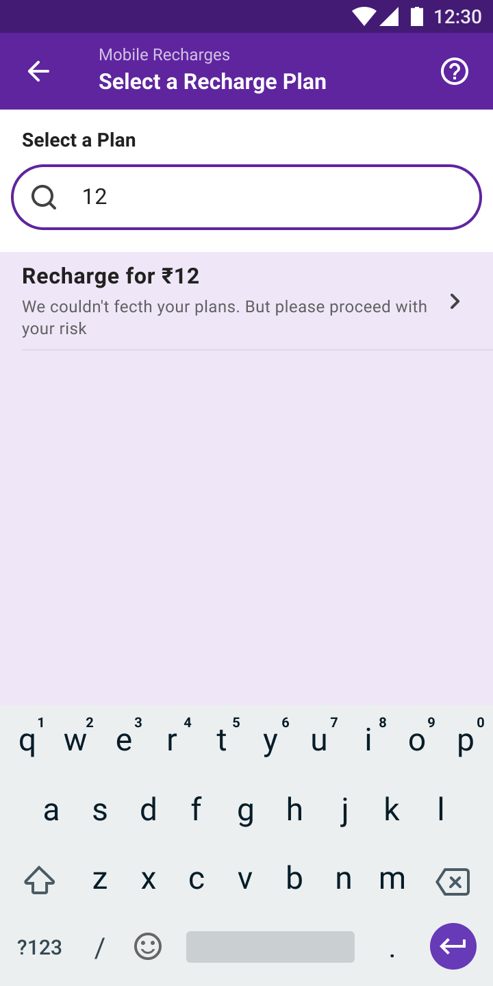
Plans down — manual
amount still works
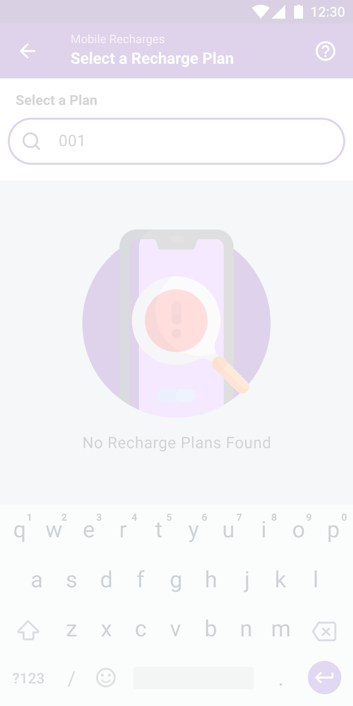
Null search —
designed, not defaulted
Habitual users have a set pattern. The design should accelerate it, not disrupt it.
Utility payments fail. Design the failure state as carefully as the success state.
Every input that can be remembered should be. Cognitive load is the enemy of conversion.
Mobile, DTH, electricity, and gas have different flows — but one mental model.
Reported results include a 62% increase in repeat recharge rate, 71% successful retry-and-completion after failure and an 85% improvement in search-to-payment completion. The 71% figure is a completion level; the other two are reported changes. Platform reach is context, not a result of this redesign.
The leadership lesson is to define quality under imperfect conditions. A frequent financial task needs an understandable response when a dependency fails, as well as an efficient happy path.
When users do something every month, one extra tap costs real time over a year. The math on removing a tap from a 100M-user flow is staggering.
A first-time bill-payer in rural Bihar and a power user in Bengaluru share the same screen. That tension forces the truly universal pattern.
Design must absorb operator delays, API timeouts, and activation windows outside PhonePe’s control — and explain clearly what remains outside the app’s control.